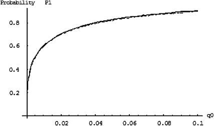
Figure 1.—
The probability of the truly associated marker being included among the top  of the markers under different genetic models for the same population allele frequency (0.20) and allele frequency difference between the case and control groups (0.05). From top to bottom, the curves correspond to the dominant model, additive model, multiplicative model, and recessive model, respectively. The sample size is
  , the error rate is
  , and the number of pools formed for either the cases or the controls is
  . We assume that the number of disease-associated markers is
  .
.

