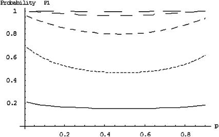
Figure 2.—
The probability of the truly associated marker being included among the top 6.7% of the markers when the number of disease-associated markers is  . The sample size is
  , the error rate is
  , and the number of pools formed for either the cases or the controls is
  . From top to bottom, the curves correspond to allele frequency differences of 0.10, 0.07, 0.05, 0.03, and 0.01, respectively.

