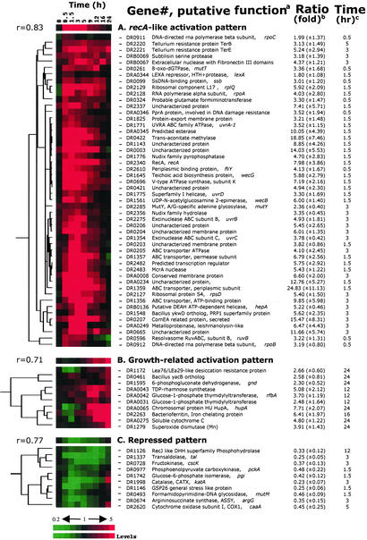
Figure 2.
Hierarchical clustering analyses of expression profile patterns. Gene expression patterns are displayed graphically. Three distinct patterns are sorted according to the hierarchical clustering analyses, i.e., recA-like activation pattern (A), growth-related activation pattern (B), and repressed patterns (C). The top row represents the general pattern of the selected group where a Pearson correlation coefficient (r) is shown on the left side. All displayed graphs are organized in a row/column format. Each row of colored strips represents a single gene whose expression levels are color-recorded sequentially in every column of the same row that represents recovery time intervals. Red denotes up-regulation and green indicates down-regulation. Black indicates the control level. The variation in transcript abundance is positively correlated with the color darkness. a, Gene numbers are offered for tracking the primary information of the gene of interest; b, the maximum (for recA-like and growth-related activation pattern) or minimum (for the repressed pattern) expression level for each of the exhibited genes over the 24-h recovery period is presented as the dye intensity ratio of the irradiated sample to the nonirradiated control at c, the indicated time interval. Values in parentheses show the standard deviation for each mean expression ratio.

