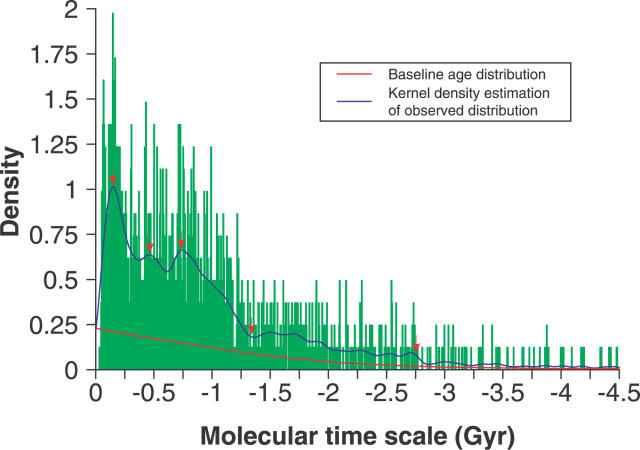
Figure 1. Density Histogram of Overall Transmembrane Gene Duplication Events.
The density trace (blue line) was obtained by using the Gaussian kernel density estimation with the bandwidth selected by Sheather and Jones' method [55]. The red line shows the estimate of the systemic bias in the overall distribution of duplication events, which was obtained by recalculating the mean value in each bin of 10,000 Monte Carlo–simulated histograms and smoothing the mean values with function “lowess” available in the statistics package of R environment [54]. The distinct transitions of the density trace are marked with red arrows.

