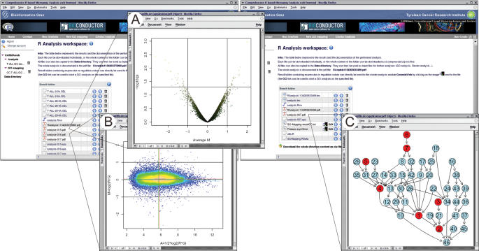
Figure 3.
Result workspaces of a differentially expressed genes analysis (left) and a GO analysis (right). (A) Volcano plot displaying the mean differential expression against P-values (−log10 of the P-value) of all genes. (B) MA plot. Points are colored according to local point density with brighter colors coding for higher density. (C) The induced GO graph of the genes of interest. Red nodes represent over-represented GO terms.

