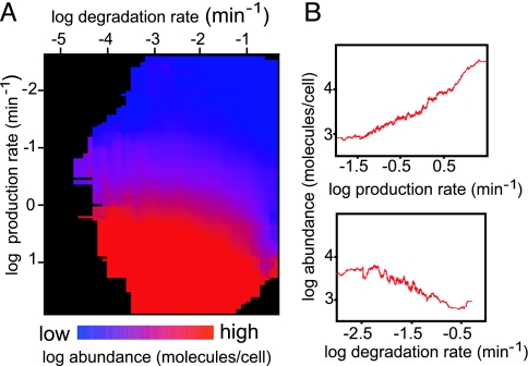
Fig. 3.
Protein half-life and production rate influence protein abundance. (A) Heat map illustrating the functional relationship between protein production rate (mRNA abundance × ribosome density; y axis), degradation rate constant (x axis), and protein abundance (color-coded). See Data Sources in Methods for details on the data sets used. Each point represents a 2D bin, including all proteins with a degradation rate constant and protein production rate in a defined range. The color of the bin represents the average abundance of the proteins contained within it. Higher values are indicated in shades of red, and lower values in shades of blue. Empty and near-empty bins are colored black. (B) Two-dimensional plot of the relationship between protein abundance and protein production (Upper) or degradation rate constant (Lower). The plots are generated by using a moving average of a window of 100 genes.

