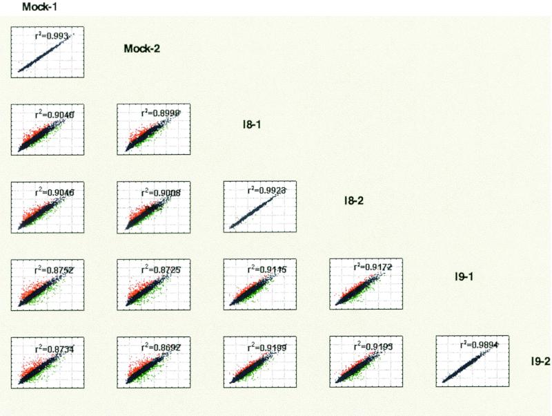
FIG. 1.
Comparison matrix of normalized intensity values from microarray slides by scatter plot. Normalized logarithmic intensity values obtained from each individual array were compared between each sample and depicted as a scatter plot. The annotation of the x axis is shown to the right of the matrix, whereas the y axis annotation is shown on top. Values that differ more than 1.8-fold are shown in red (high) or green (low). Also shown is the correlation coefficient r2 for each comparison. The highest correlation was observed when for results obtained from the same sample hybridized to two arrays. Comparisons between the two different infected samples, I-8 versus I-9, were more similar to each other than comparisons between infected samples and mock-infected DMVEC isolated in parallel.

