
Figure 1.
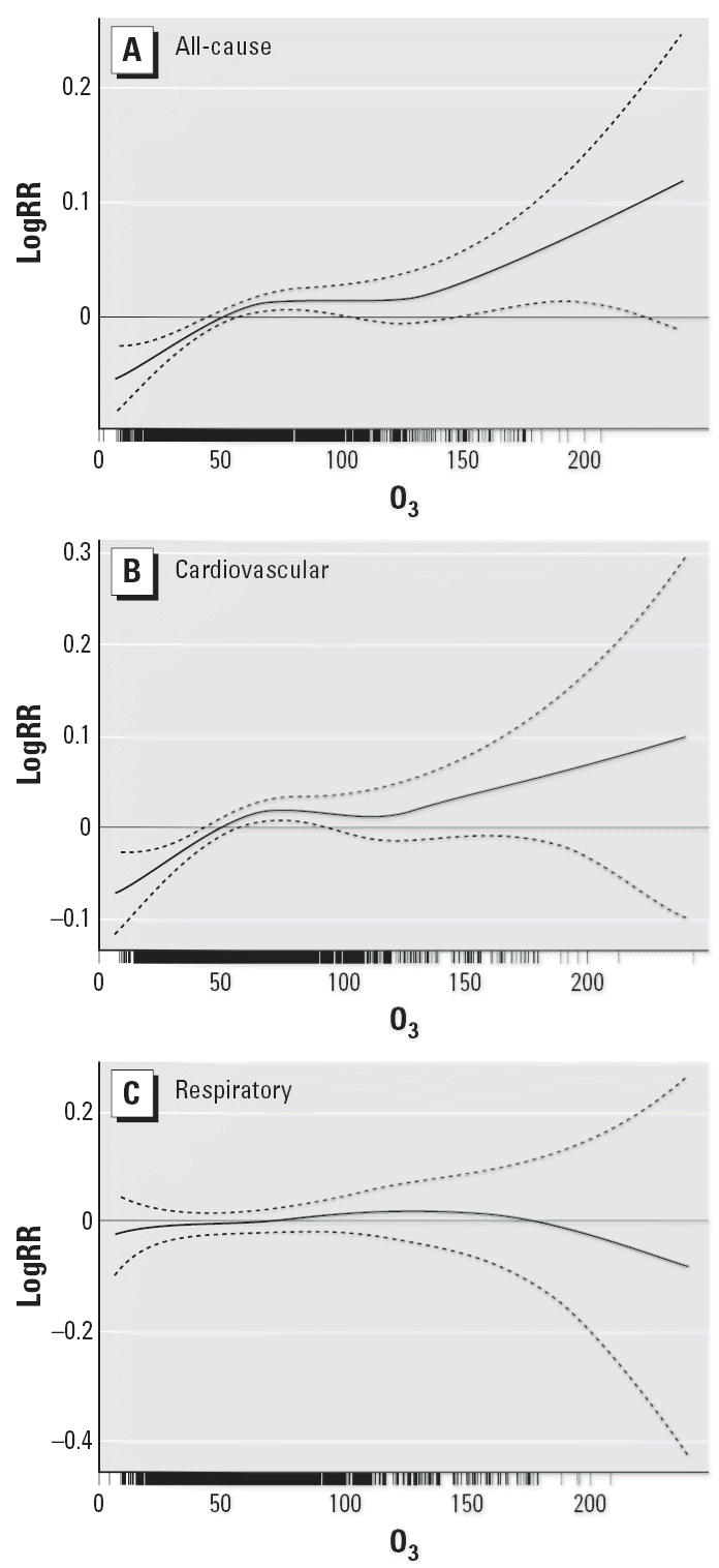
Smoothing plots of O3 concentration (μg/m3) against mortality risk (logRR, log relative risk; df = 4). (A) All-cause mortality. (B) Cardiovascular mortality. (C) Respiratory mortality. The solid line indicates the estimated mean percentage of change in daily mortality, and the dotted lines represent twice the pointwise SE.