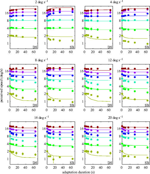
Figure 2.
Perceived speed (solid symbols) as a function of adaptation duration and the best fit of the model (solid lines). Each panel represents the results for one adaptation speed (indicated above the graph). Each test speed is represented by a different colour. The results for each subject (SB and DS) are shown separately. Error bars represent ±s.e.m.

