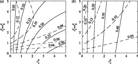
Figure 5.
Contour plots of the proportion of both susceptible nodes (continuous lines) and exposed and infectious nodes (dashed lines) that were removed by tracing during the epidemic. The two plots contrast the case of effective tracing (long latency period and few connections per node) with the case of less effective tracing (short latency periods and many connections per node). The other parameters used were: R0MF=3.0, Inf_P=3.5, Tr_P=2.0 and (a) K=5, Lat_P=10.0 and (b) K=20, Lat_P=3.5.

