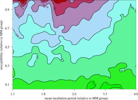
Figure 4.
Contour plot for sensitivity analysis to explore the impact of wider genetic susceptibility on predictions. The x-axis shows the scaling of the mean incubation period in the non-MM genotypes compared with the MM genotypes (e.g. 2 indicates a mean incubation period double that in the MM genotypes). The y-axis shows the relative susceptibility to infection of the non-MM genotypes compared with the MM genotypes, where a value of 1 indicates identical susceptibility and a value less than 1 indicates lower susceptibility. The colours and contour lines represent the total number of future cases of vCJD.

