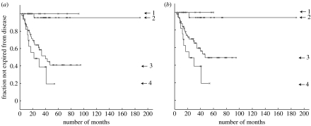
Figure 3.
Kaplan–Meier plots for the Sorlie et al. (2001) dataset. The graphs show fraction not expired from the disease (y-axis) versus number of months (x-axis). (a) For KM1 there are nine patients in process 1, 32 in 2, 48 in 3 and 18 in 4 (the remaining eight samples are insufficiently identified with a process). A vertical drop indicates expiry from the disease and a star indicates the patient is not recorded as expired from the disease (this includes the point at which some patients exited the survey). (b) KM2 corresponds to a different initialization of the algorithm (see text) with 7, 23, 58 and 18 patients assigned to processes 1 to 4, respectively. With different initializations there is some variability in the assignment of patients to processes 1 to 3, though process 4 remains quite distinct with 18 patients usually assigned, both using the variational LPD used here and the alternative MCMC approach described in appendix B (see figure 18a).

