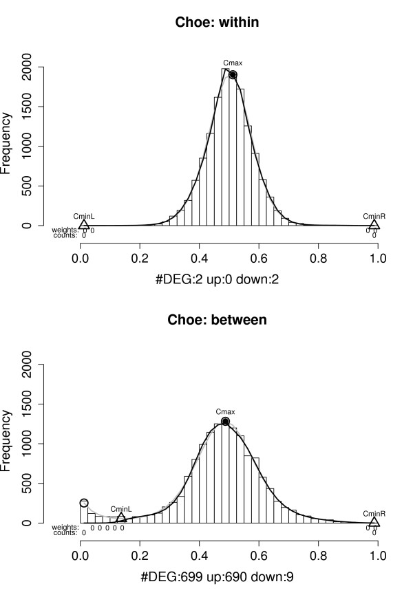
Figure 4.

Example histograms of the sets of P(dg < 0) values for within and between condition single replicate comparisons – Choe data set. Results shown are for analyses of condition C replicate 1 against condition C replicate 2 (upper panel) and condition C replicate 1 against condition S replicate 2 (lower panel). Grey curve: f, black curve: f0, grey circles: local maxima, grey triangles:  and
and  , black point in grey circle:
  (see text). DEG: estimated number of differentially expressed genes,
  ."weights": a 0 indicates that the category is given zero weight when fitting f0. "counts": a 0 indicates that the category is fixed to have count zero when fitting f0. "up" and "down" denote the estimated number of over- and under expressed genes,
  and
and  . The upper histogram exhibits the shape expected under the null-hypothesis of no differentially expressed genes (the grey and black curves overlap), the lower indicates the presence of a subset of over-expressed genes.
