
Figure 4.
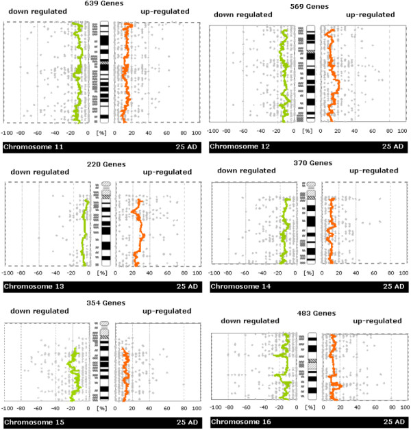
Whole-chromosome plots of running average of fractions of samples showing up-/down-regulation in tumor versus normal samples (Chromosomes 11, 12, 13, 14, 15, 16). For each chromosome you see a separate figure. Gray dots denote the number of patients with up- or down-regulation for a single gene. Orange/green lines represent a running average of these values. The plots are made to be easily comparable with whole-genome CGH plots (like e.g. those in Knösel et al. [21]) Further details of plot construction are described in the methods section.