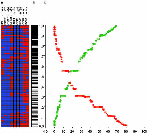
Figure 3.
Final biological and clinical predictor model. a: Tree-view representation of the eight markers and IPI. Each column represents a marker, while each row corresponds to a patient, ordered according to the assigned failure probability. Specific weight of each marker is included at the top of each column. b: Real status of each patient (failure, black vs. maintained complete response, white). c: Graphic representation of the relation between the assigned probability and the real status. The graphic represents the accuracy of the predictor model. If the probability assigned to each patient (y axis) is less than 0.5, the model classifies the case into the group of maintained response. If the probability is greater than 0.5, the system classifies the case as a failure. The curves represent the number of patients erroneously classified as failure (in red), and those cases erroneously predicted to maintain a complete response (in green). Eventually, a threshold for each curve of cumulative error could be chosen to select a group of patients with a high probability of failure or of maintained complete remission.

