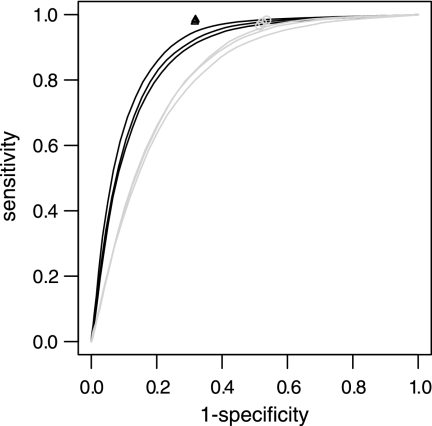
FIG. 6.
ROC curve showing the performance for different analysis approaches. Black lines and triangles, W3110 samples mapped to the EDL933 genome; grey line and circles, EDL933 samples mapped to the W3110 genome. The plot shows the performance when applying a threshold to log2 intensities (black and grey lines) and when segmenting and merging log2 intensities (grey circles and black triangles). Black and grey lines indicate the sensitivity as a function of the false-positive rate (1 − specificity). Grey circles and black triangles show that the performance when using segmentation and merging was clearly above the ROC curve for the simple threshold approach.

