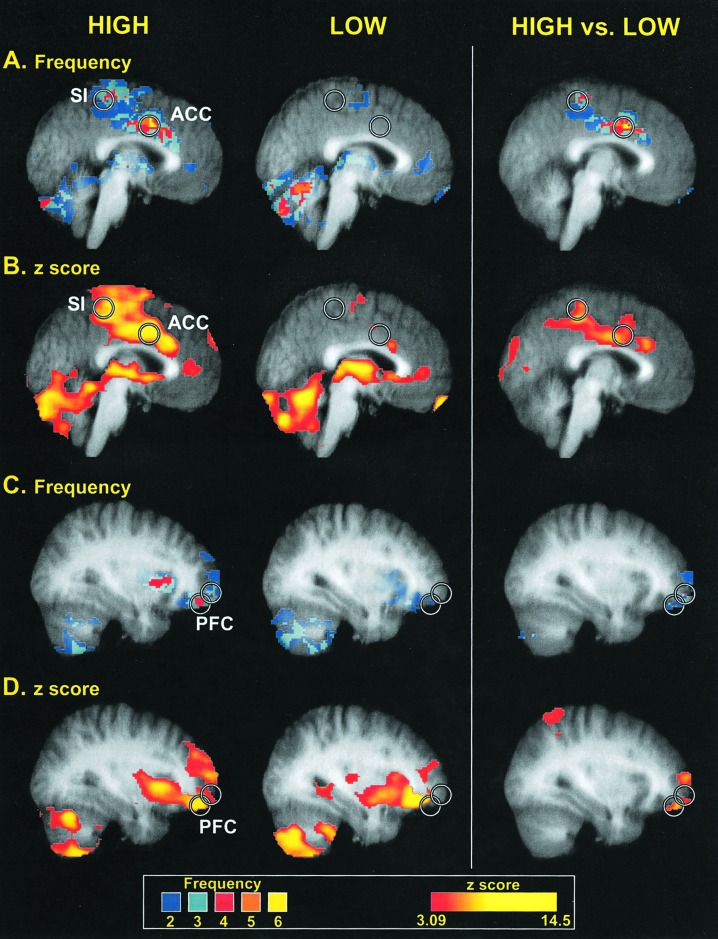
Fig. 2.
Brain regions displaying different frequencies of activation between high- and low-sensitivity subgroups. Circles are centered on regions where the peak differences between groups were located. Colors in A and C correspond to the number of individuals displaying statistically significant activation at a given voxel (frequency), whereas colors in B and D correspond to the z-score of the subgroup analysis. Slice locations in A and B are -2 mm from the midline, whereas slice locations in B and C are 32 mm from the midline (in standard stereotaxic space). Structural MRI data (gray) are averaged across all individuals involved in corresponding functional analysis.

