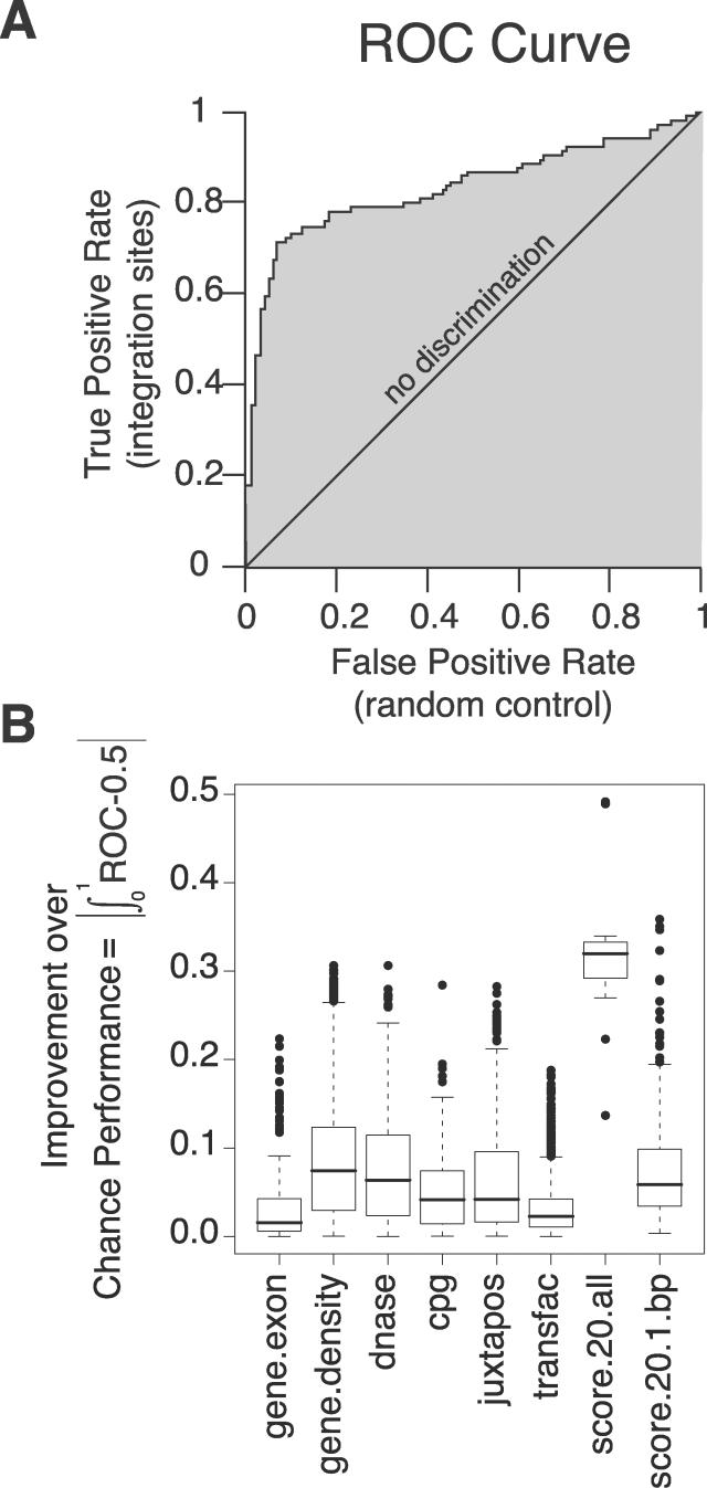
Figure 1. ROC Curves as a Measure of the Association of DNA Integration with Genomic Features.
(A) Diagram of the ROC analysis. The graph plots the true positive rate against the false positive rate for every possible cutpoint; vertical steps result when only the true positive rate increases as the cutpoint (i.e., cutoff value for the genomic feature) moves down; horizontal steps result when only the false positive rate increases, and when both rates increase as the cutpoint moves down the graph “steps” diagonally. The example shows the effects of score.20 on SB integration (though the method of construction is general). The area between the curve and the “no discrimination” line indicates discrimination between integration sites and random controls by the predictor tested. The curve will lie beneath the line of “no discrimination”—leading to an area of less than 0—if integration sites tend to have lower values of the variable under study than random controls. For details see the text and Text S1.
(B) Box plots summarizing ROC results. Each box in Figure 1B indicates the first and third quartiles of the values, while the heavy line in the middle gives the median value. The “whiskers” extend to the most extreme observation within 1.5× the interquartile range of the median. Points that lie beyond the whiskers are plotted individually. For each box plot, the number of points is 17 (the number of datasets) times the number of rows in the relevant heat map for that feature (in Text S2; selected examples of heat maps are shown in Figures 2–4). Specifically, the numbers of points were 170 for gene.exon, 1173 for gene.density, 153 for dnase, 306 for cpg, 340 for juxtapos, 1870 for transfac, 17 for score.20.all, and 340 for score.20.1.bp.

