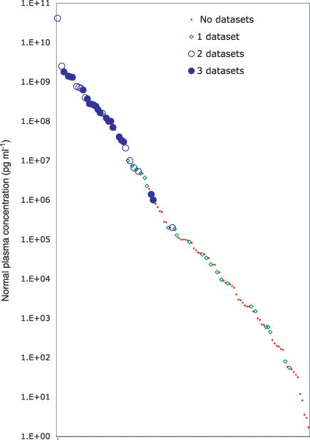
Figure 2.
A plot in which normal plasma concentrations for 115 proteins from Table 1 (distributed along the X-axis but unlabelled because of legibility limitations) are plotted on a log scale (pg ml−1 along the Y-axis). The proteins are sorted by abundance to reveal the smooth distribution across > 10 logs of concentration. Each protein is represented by a symbol that indicates in how many of three proteomics datasets (see text) it was detected.

