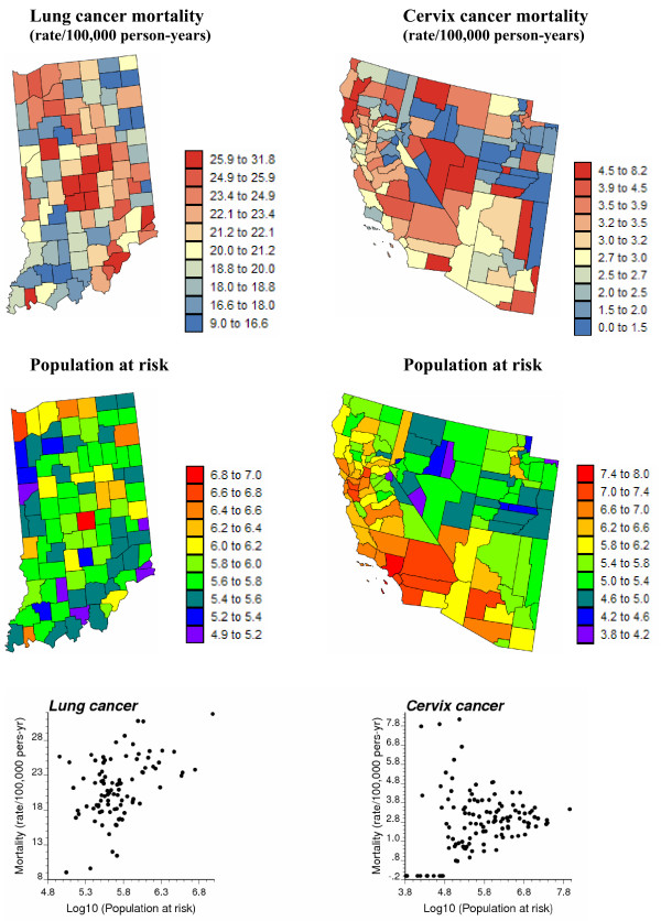
Figure 1.
Geographic distribution of age-adjusted lung and cervix cancer mortality rates and the populations at risk. For the two top maps, the fill color in each county represents the age-adjusted mortality rates per 100,000 person-years recorded over the period 1970–1994 for white females (class boundaries correspond to deciles of the histogram of rates). The middle maps represent the population at risk which was back-calculated from the rate and count data (lognormal scale). The bottom scatterplots illustrate the larger variance of rates computed from sparsely populated counties, in particular for the least frequent cervix cancer.

