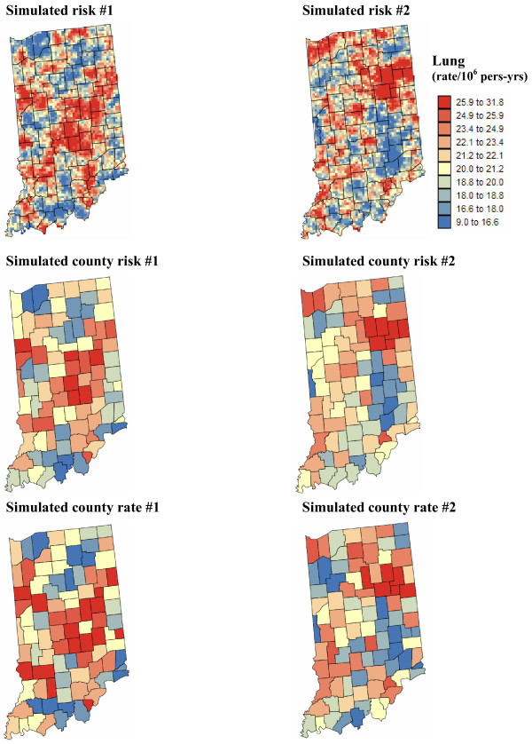
Figure 10.
County maps of lung cancer mortality rates simulated under two scenarios for the underlying continuous risk map. The number of cases for each county was simulated by random sampling of a Poisson distribution that is defined by the white female population map of Figure 1 and the county-level aggregation of a continuous risk map generated using sequential Gaussian simulation. The units are age-adjusted mortality rates per 100,000 person-years. The color legend applies to all the maps; the class boundaries correspond to the deciles of the histogram of original rates.

