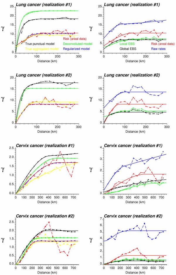
Figure 12.
Semivariogram models inferred from the simulated rate maps of Figures 10 and 11. The left column shows the experimental semivariogram of the risk estimated from county-level rate data (red curve), and the results of its deconvolution (green curve) which is reasonably close to the "true" point-support model (black curve). The regularization of the point-support model yields a curve (blue line) that is very close to the experimental one. Yellow curves represent the semivariograms computed from the underlying county risk maps. Right column shows the semivariogram of raw rates, as well as the semivariograms of global and local empirical Bayesian smoothed (EBS) rates.

