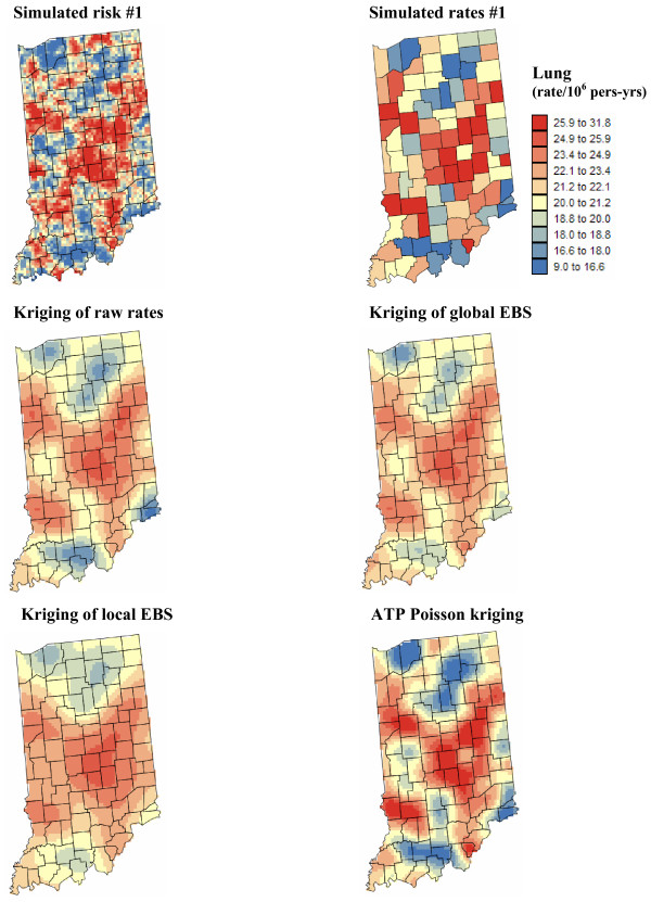
Figure 13.
Simulated lung cancer risk map and the results of the different forms of area-to-point kriging. The fill color represents mortality risk per 100,000 person-years simulated by sequential Gaussian simulation and the results of the estimation using the following approaches: point kriging of raw rates, point kriging of global and local empirical Bayesian smoothed (EBS) rates, and area-to-point (ATP) Poisson kriging. The color legend applies to all the maps; the class boundaries correspond to the deciles of the histogram of original rates.

