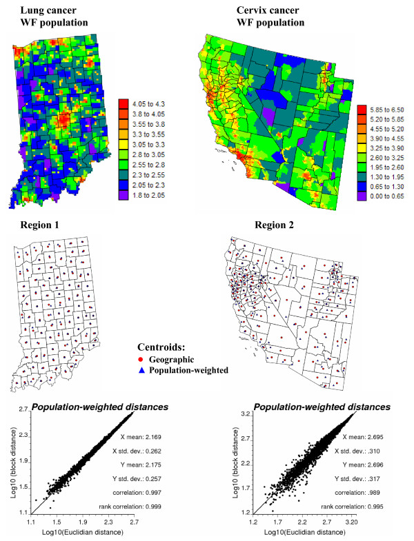
Figure 2.
High-resolution population maps and their use to compute population-weighted distances between counties. The county-level population estimates of Figure 1 were allocated to a grid of 25 km2 cells according to the 2000 census block level data. The scattergrams plot Euclidian distances between county geographic centroids, depicted by red dots in the middle maps, versus a "block distance" that accounts for the shape of counties and the distribution of the population (Equation 1). Population-weighted centroids are depicted by blue triangles in the middle maps.

