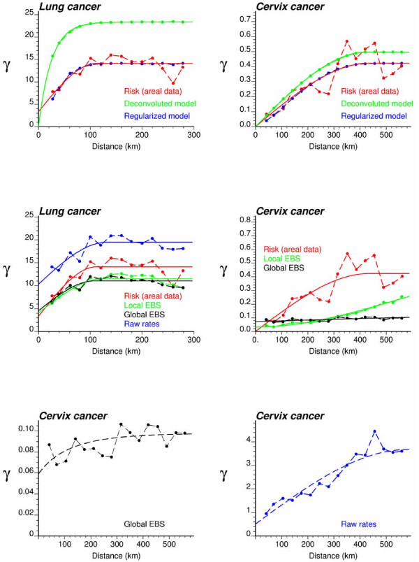
Figure 3.
Semivariogram models used by the different geostatistical approaches for mapping lung and cervix cancer mortality. The top graphs show the experimental semivariogram of the risk estimated from county-level rate data (red curve), and the results of its deconvolution (green curve). The regularization of the point-support model yields a curve (blue line) that is very close to the experimental one. Bottom graphs show the semivariogram of raw rates, as well as the semivariograms of global and local empirical Bayes estimates.

