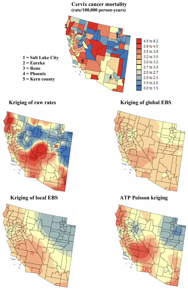
Figure 6.
Map of cervix cancer mortality rates in Region 2, and the risk estimated by the different forms of kriging. The fill color represents the age-adjusted mortality rate per 100,000 person-years recorded over the period 1970–1994 (top graph) or the risk estimated using the following approaches: point kriging of raw rates, point kriging of global and local empirical Bayes smoothers (EBS), and area-to-point (ATP) Poisson kriging. The color legend applies to all the maps; the class boundaries correspond to the deciles of the histogram of original rates.

