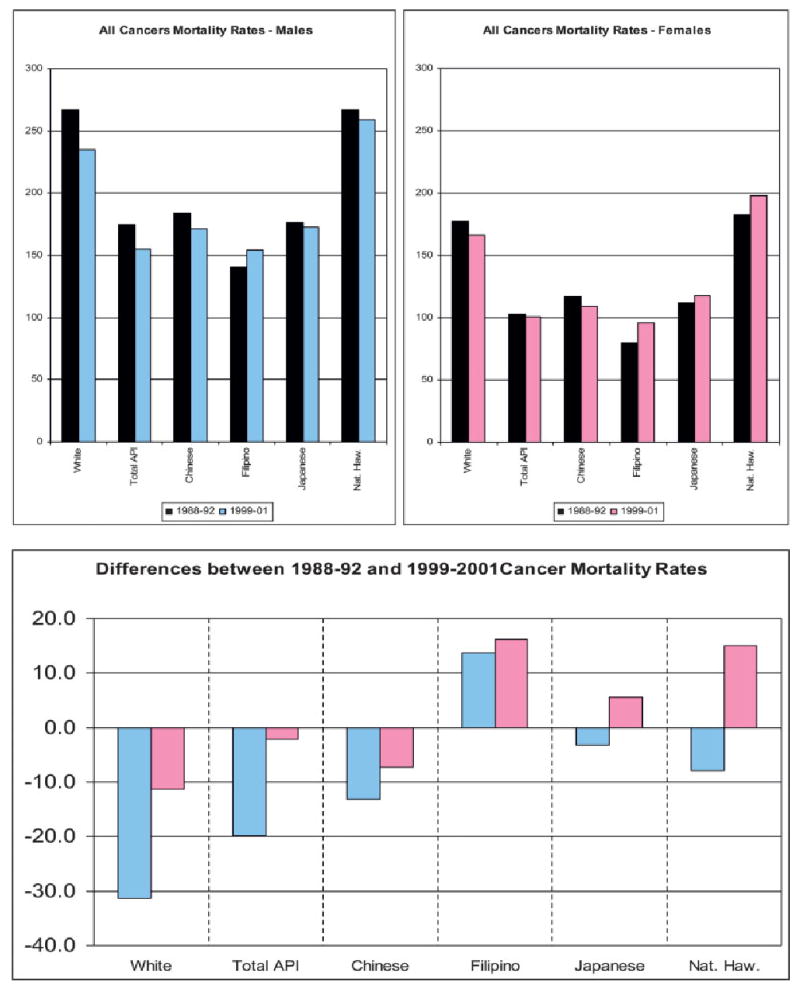
FIGURE 1.

Upper panels report all cancer mortality rates for 1988–1992 (in black) and the upper boundary estimate of the 1999–2001 rates for males (blue, left graph) and for females (pink, right graph). Lower panel is the difference between 1999–2001 and 1988–1992 cancer mortality rates for all cancers. A positive value indicates that the 1999–2001 rate is greater than the 1988–1992 rate. A negative value indicates that the 1999–2001 rate is less than the 1988–1992 rate. Differences in the male rates are in blue, and differences in the female rates are in pink. Total API: Total Asians and Pacific Islanders; Nat Haw: Native Hawaiians.
