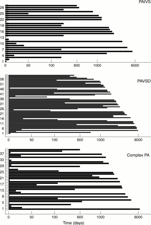
Figure 1 .

Survival plots for patients in all three groups. The length of the line shows time to follow up or death (in days). Patients are plotted in birth order on the y axis so that lines stopping short of the right hand outline indicate death, while those reaching the right hand outline indicate survival at latest follow up. Note that a three step linear scale is employed, as a logarithmic or linear scale would distort the plot.
