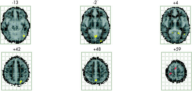
Figure 3 .
Brain activation pattern showing the regional differences between the two groups (six very preterm subjects and six controls) after analysis of covariance. Regions shown in yellow are those that show significantly more activation in the control group. Regions shown in red are those that show significantly more activation for the very preterm subjects with evidence of thinning of the corpus callosum.

