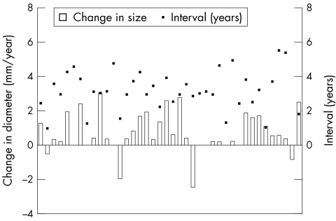
Figure 3.
Rate of diameter change (mm/year) versus the number of years of follow up (years) for the moderate sized group. The boxes on the x axis represent the increase (above line) or decrease (below line) in diameter. The black dots represent the number of years of follow up for each respective defect.

