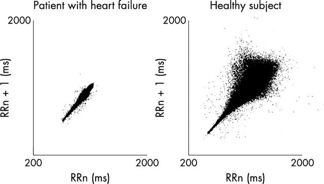
Figure 2.
Lorenz (Poincare) plot. The current NN interval (x axis) is plotted against the previous NN interval (y axis). In healthy subjects there is a notable disparity between the two NN intervals; at longer NN intervals lie low heart rates. This is not so in patients with heart failure. Reproduced with permission from Woo MA, et al. J Am Coll Cardiol 1994;23:565–9.

