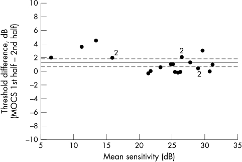
Figure 4.
Mean versus difference plot for SAP threshold measurements made during first and second halves of data acquisition during MOCS testing, designed to extract information about any fatigue occurring during the course of testing with this threshold measurement strategy. The solid line represents the mean group difference and the broken lines denote upper and lower 95% confidence limits for the group mean difference.

