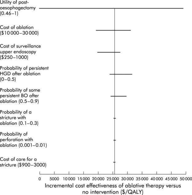
Figure 8.
“Tornado diagram” displaying changes in incremental cost effectiveness over a range of plausible values for key variables. This figure demonstrates the changes in the incremental cost effectiveness ratio (ICER) of ablative therapy versus no intervention as multiple key inputs are varied. Input variables are listed on the Y axis, along with the clinically plausible ranges over which they were varied. The bars represent the range in reported ICER for that range of the input variable. Items near the “top” of the tornado (that is, utility of the post-oesophagectomy state and cost of ablation) have a greater impact on the performance of the model than those at the “bottom” of the tornado (that is, probability of perforation and cost of care of a stricture). HGD, high grade dysplasia; QALY, quality adjusted life years.

