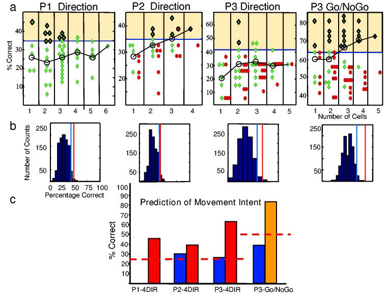
Figure 4.
Maximum likelihood analysis results for all patients and tasks. a, Classification percentages for all possible combinations of neurons in periods after presentation of the relevant cue (green diamonds) and in control periods before the presentation of the cues (red circles). The graph is split into columns according to the number of cells that make up the combination. Significant cell combination predictions fall in the yellow-shaded area (binomial distribution, p<0.05). Significant predictions with the shuffle procedure (p< 0.05) have an additional dark outline. Black line connects mean percentage correct prediction (o) for each column. b, Histograms of distribution of the 1000-shuffle classification results for one cell combination from each participant and task, as noted in a. Red line denotes actual percentage correct prediction for cell combination (not shuffled). Blue line= p< 0.05 criterion (shuffled histogram), c, Predictions for the same 4 cell combinations as in b in the test epoch (red and yellow) and for the control periods (blue). Note: P1 had no control period. The red, dashed line indicates expected chance level for each task.

