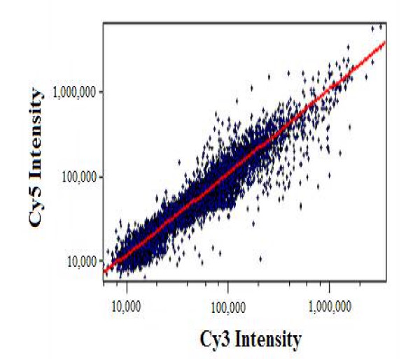
Figure 3.
Scatter plot of measured intensities for both fluorescent dyes on a log-log scale prior to normalization. The measured intensities are in arbitrary units. Each point in the graph represents a single spot on a hybridized microarray. In addition, the red line shown is the best-fit line calculated for the data with a slope that is close to unity.

