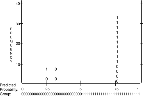
FIG. 3.
Classification plot derived from logistic regression analysis. The x axis is the predicted probability (Prob), from 0.0 to 1.0, of the dependent being classified “1” (disease). The y axis is frequency, i.e., the number of cases classified. Inside the plot are columns of observed ones and zeros, which stand for disease and health, respectively, with 2.5 cases per symbol.

