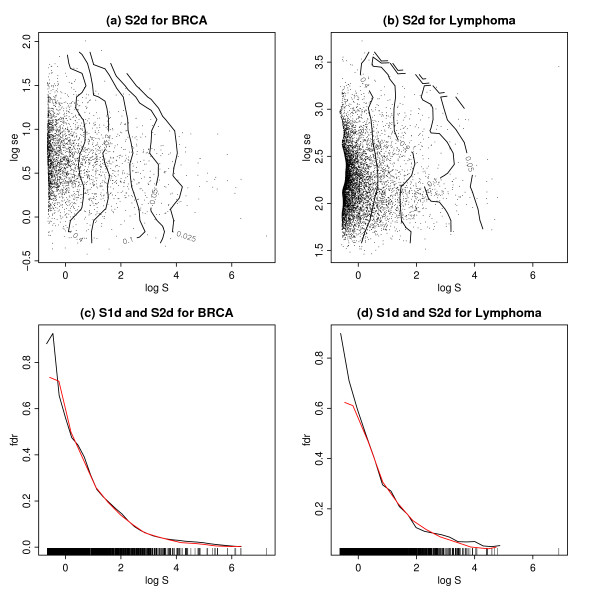
Figure 1.
S2d and S1d for the BRCA and Lymphoma data sets. (a) A scatter plot of the BRCA data, with log on the horizontal axis and log se on the vertical axis. Each symbol corresponds to a gene. The isolines shown are the local fdr based on the S2d method. (b) The same as (a) for the Lymphoma data. (c) The local fdr for the BRCA data, shown as a function of log on the horizontal axis. The black line shows the local fdr computed via S1d, the red line shows the fdr based on S2d, averaged across the log standard errors as shown in (a) above. (d) The same as (c) for the Lymphoma data.

