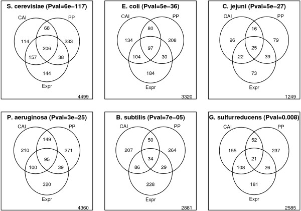
Figure 3.
Venn diagram. Illustrates the overlap between genes predicted to be highly expressed by CAI (top 10%) and position preference (bottom 10%), and genes with high microarray gene expression values (top 10%). Thus, the number found in the intersection between all three circles refer to the number of genes predicted to be highly expressed by either measure and also found to be highly expressed experimentally. The number found outside the circles refer to the number of genes that are not highly expressed and not predicted as such by either method. The organisms are ordered by the significance of the overlap between position preference (PP) and highly expressed genes (Fisher's exact test [40]).

