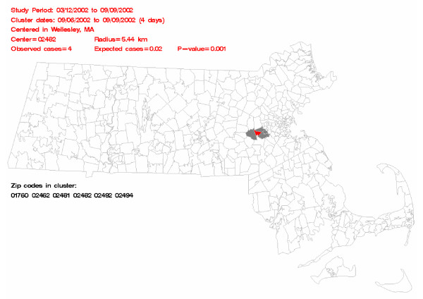
Figure 1.
Sample output page generated using the map macro. Some key information about the most likely cluster appears in red text above the map, while the zip codes in the most likely cluster are listed below the map in black text. The zip code colored in red is the center of the most likely cluster, and the gray zip codes are the other zip codes in the most likely cluster.

