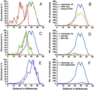
Figure 5.
Distance distributions for subets of mammalian homeodomains. A, C, and E show curves adjusted to 100% for the y axis; B, D, and F depict the actual distance counts. The overall shape of curves is identical between both graphs, which differ only with reference to the y axis. (A and B) Results for all distinct mammalian homeodomain sequences combined are shown in blue, results for HOX homeodomains in red, and results for the remaining sequences in yellow. (C and D) Distance distributions for Nkx-like (orange) and prd-like (green) homeodomains are compared with those for all mammalian sequences (blue). (E and F) Results for a mammalian sequence dataset from which all duplicates were removed. In comparison to the full mammalian sequences dataset, the curve peaks at a greater distance, and the shoulder indicative of related genes is markedly reduced.

