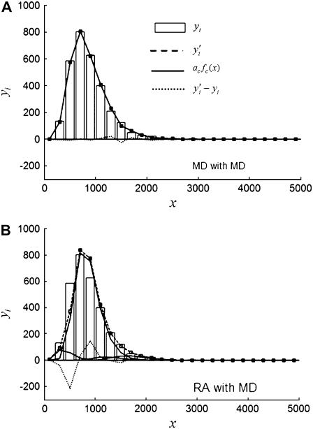
FIGURE 6.
Best-fit results for simulated distribution 5MD (see Tables 1 and 4; a Case II example) fitted with (A) MD basis histograms and (B) RA basis histograms. The vertical bars are the simulated data  , the dashed line is a plot of the best fit result,
  , the solid lines are plots of
  (see Table 4); and the dotted line is a plot of the residuals of the fit (
 ).
).

