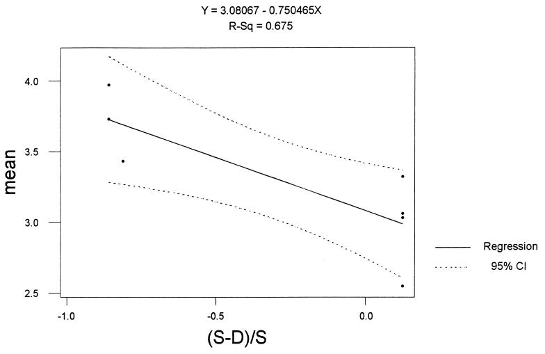
Figure 2.
Regression: Mean price versus excess supply. The mean of each experiment is computed and plotted with dots against the value of the initial excess supply. The dots at left represent the cash rich experiments that are associated with higher prices, while those at the right are endowed with an excess of asset. A linear regression is displayed by the solid line, with 95% confidence intervals shown by the broken lines.

