Figure 4.

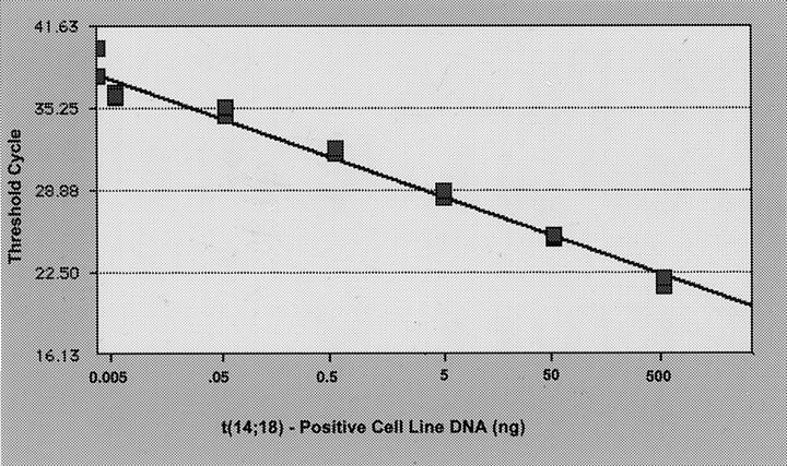
Standard curve showing the input DNA concentration versus threshold cycle. The standard curve was generated from the fluorescence data shown in Figure 3 ▶ . Each point represents the mean of the triplicate PCR amplifications.

Standard curve showing the input DNA concentration versus threshold cycle. The standard curve was generated from the fluorescence data shown in Figure 3 ▶ . Each point represents the mean of the triplicate PCR amplifications.