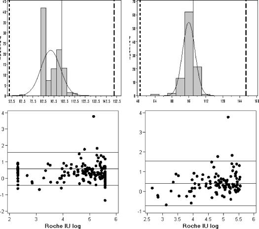
FIG. 2.
Percent similarity histograms and Bland-Altman difference scatter plots for the total group (n = 256, left) and the trimmed group (n = 108, right). The histograms plot the frequency of the percent similarity values between the AMPLICOR and EasyQ results and show the number of similar results in each percent similarity interval. The normal curves are included, which visually show the accuracy between the methods (closeness of the peak to the 100% similarity line) and the precision (spread around the mean). The 100% similarity and 50 and 100% reference lines are also included. The summary statistics for these models are presented in Table 4.

