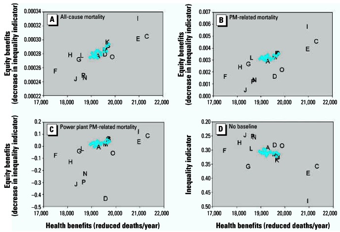
Figure 5.
Sensitivity of efficiency–equality tradeoff conclusions to choice of baseline, with model otherwise specified as in Figure 2. Baselines: (A) All-cause mortality; (B) PM-related mortality; (C) power plant PM-related mortality; and (D) no baseline. The y-axis in D represents the inequality indicator itself rather than a change in the inequality indicator, and the axis is inverted so that more equitable scenarios remain in the upper-right quadrant of the graph.

