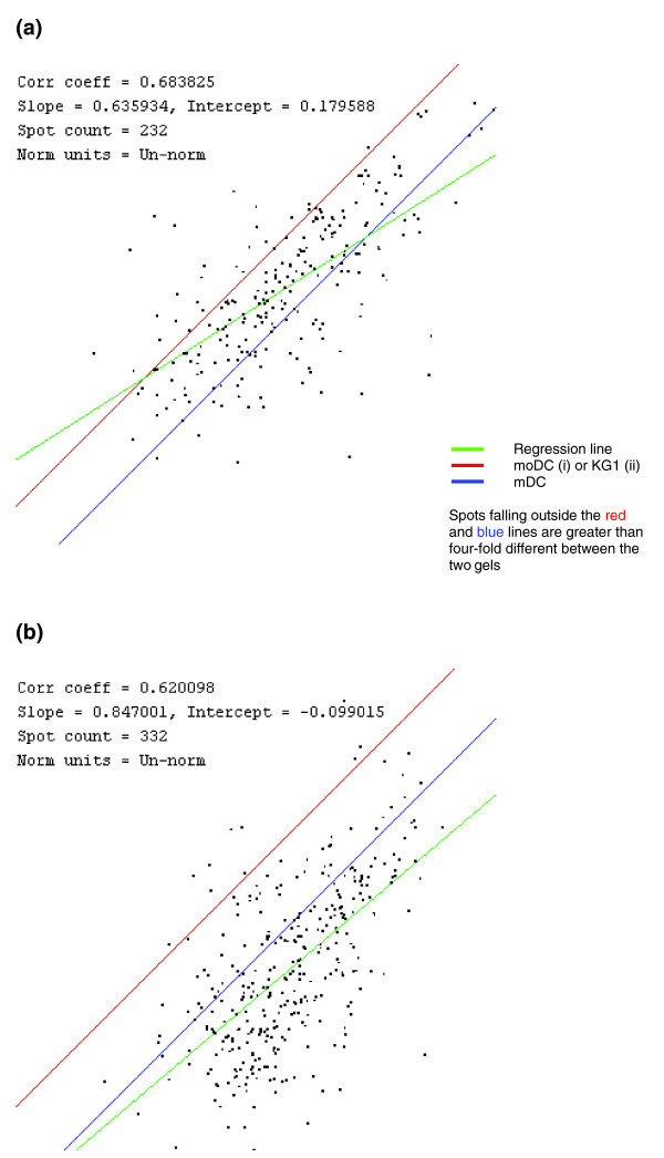
Figure 4.

Comparison of matched spots in all three cell types. A comparison of mDCs with (a) moDCs and (b) KG-1 cells is shown by plotting the quantity of each spot in one gel (x axis) with the quantity of each spot in the second gel (y axis). The regression line generated from the plot is shown in green, and spots that fall between the red and blue lines are within two-fold higher or lower in either of the gels. A correlation coefficient was obtained from the regression line.
