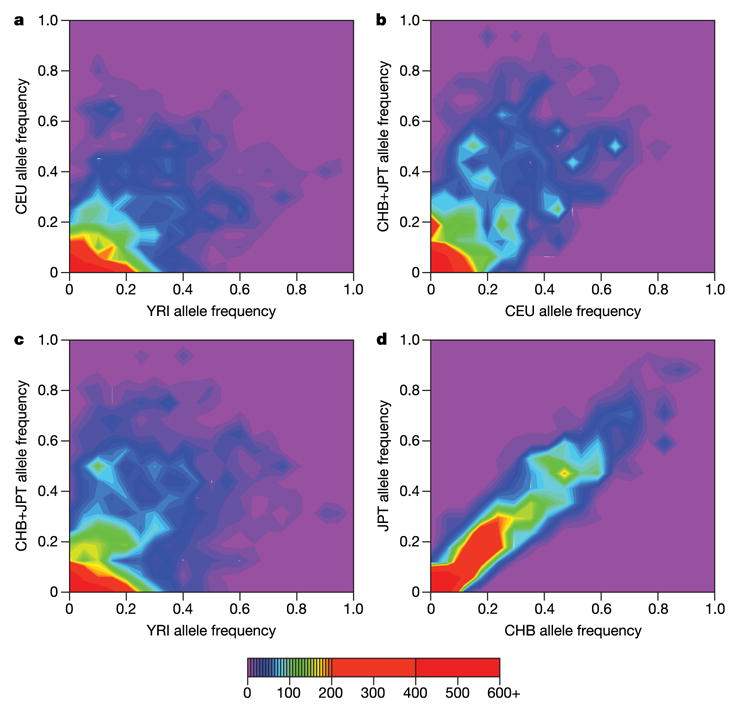
Figure 6. Comparison of allele frequencies in the ENCODE data for all pairs of analysis panels and between the CHB and JPT sample sets.

For each polymorphic SNP we identified the minor allele across all panels (a–d) and then calculated the frequency of this allele in each analysis panel/sample set. The colour in each bin represents the number of SNPs that display each given set of allele frequencies. The purple regions show that very few SNPs are common in one panel but rare in another. The red regions show that there are many SNPs that have similar low frequencies in each pair of analysis panels/sample sets.
