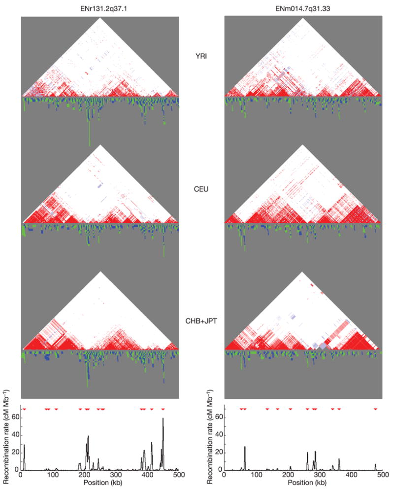
Figure 8. Comparison of linkage disequilibrium and recombination for two ENCODE regions.

For each region (ENr131.2q37.1 and ENm014.7q31.33), D′ plots for the YRI, CEU and CHB+JPT analysis panels are shown: white, D′ < 1 and LOD < 2; blue, D′ = 1 and LOD < 2; pink, D′ < 1 and LOD ≥ 2; red, D′ = 1 and LOD ≥ 2. Below each of these plots is shown the intervals where distinct obligate recombination events must have occurred (blue and green indicate adjacent intervals). Stacked intervals represent regions where there are multiple recombination events in the sample history. The bottom plot shows estimated recombination rates, with hotspots shown as red triangles46.
