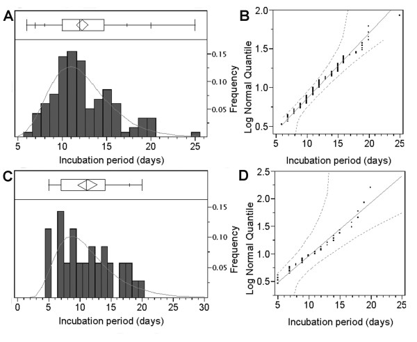
Figure 3.
The incubation period distributions of measles (A and B) and poliomyelitis (C and D) fitted to lognormal distributions. A &C) Observed frequencies (bars) are compared with predicted frequencies (solid line) based on the maximum likelihood method assuming lognormal distribution. The ends of the box represent the 25th and 75th quantiles (i.e., quartiles), and the line across the middle of the box identifies the median sample value. The means diamond indicates the sample mean and 95% confidence interval. The whiskers extending from both ends show additional quantiles (5th, 10th, 90th and 95th) on the response axis (note: for poliomyelitis (C), some quantiles are overlapping, and therefore only the 90th quantile is displayed). B & D) Lognormal quantile plots of the incubation periods. The diagonal reference lines show the line of fit and the two dashed lines denote confidence limits of 95% equal precision bounds with a = 0.001 and b = 0.99. See [54,55] for original data.

