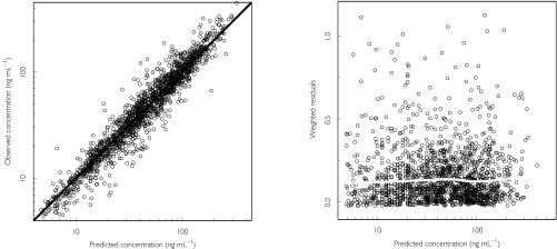
Figure 2.
Goodness-of-fit plots for the final model. The left panel shows the observed vs the predicted concentrations based on the individual parameter estimates. The thick diagonal line is the line of identity. The right panel is a plot of the absolute values of the individually weighted residuals vs the individual predictions. The solid, white and approximately horizontal line shows the results of the nonparametric smooth regression analysis.

